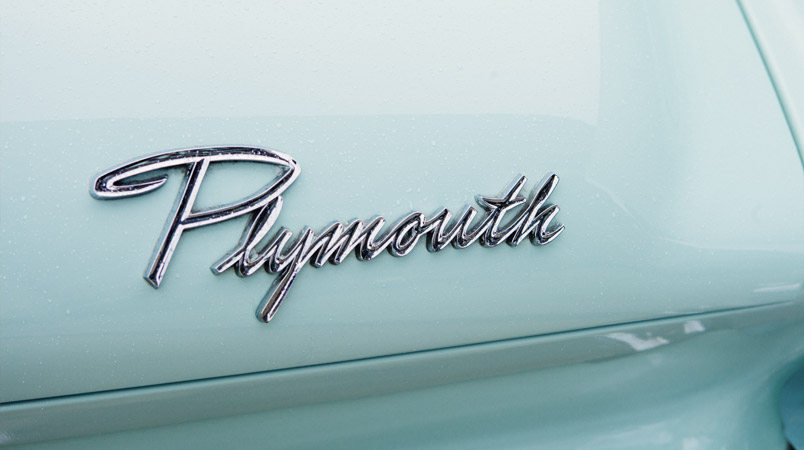
The Entrepreneur.com defines logo as: “A recognizable graphic design element, often including a name, symbol or trademark, representing an organization or product”
A logo should be original and unique
Designing a logo may look like a simple and straightforward operation. This is normally far from true; a lot of work actually goes into designing a logo as it gives a visual representation of the identity of a company, its values and its vision.
An original, unique and professional looking logo will allow a company to stand out from its competitors.
A well designed logo can greatly improve the success of a business, as it will appear on business cards, websites, advertising material and stationery.
The psychology of colours
A key element in designing a logo is its colour code and the psychology behind it. For instance, red is used by Companies like Netflix, CNN, Coca Cola, and Virgin Atlantic to stimulate feelings of passion and intensity. Ford, Twitter, Skype and Dell use blue colours in their logo as these represent loyalty, trust and intelligence.
Studies haves shown that 60% to 80% of purchasing decisions are influenced by colours, hence choosing the right colour scheme can literally make or break a product or service.
Colour is generally the first thing a consumer will notice about your logo, whether consciously or unconsciously.
An interesting infographic published by Fast Company, on the psychology of colourshighlights that a staggering “84.7% of consumers cite colour as the primary reason the buy a particular product” and that “ads in colour are read up to 42% more often that the same ads in black and white”
A Logo should be versatile and adaptable
Besides looking clean and professional a logo should be versatile in terms of style, colour and shape, as it will appear on business letters, computers, mobile devices and giant billboards, as well as shopping bags, mugs and boxes; furthermore, it should be clearly recognizable when displayed in black and white.
Below is a section of an infographic, taken fromhttp://www.entrepreneur.com/article/232401, showing the TOP 10 most valuable brands in the world with a combined brand value of almost 500 Billion dollars.
THREE GOOD REASONS TO RE-DESIGN YOUR LOGO
1) Drop the brand name
Dropping the brand name from a logo can be seen as the ultimate achievement for any company. It means that your brand and its logo are so well established, that people will recognize the logo, even without the actual brand name showing. Examples of brands that have achieved this ‘iconic status’ include Apple, Nike, Starbucks and Pepsi. The reason behind Starbucks dropping their name and the writing ‘coffee’ from their logo in 2011 was aimed at both expanding their product range and make it look more like a local business rather than a corporate business.
2) Less is often more
A clean and simple logo can often work wonders. For instance Apple has made several changes to their logos over the years and now it’s a very simply logo showing a very light grey apple with a bite taken from it.
3) Align your logo with your Company’s strategy
When your logo is no longer aligned with the company’s strategy, mission, vision and product offering it is definitely time for a revamp of your logo.
If you are considering Re-designing your logo and not sure where to start, just give us a call and we’ll be delighted to show you how a newly re-designed logo can pour new energy into your business.

